Logo files, colours and how to use them
Everything you need to put turnda in a deck, an article or a partner page — and the few rules that keep it looking like itself.
The lockups
Primary lockup
Mark plus two-tone wordmark. The default everywhere on light backgrounds.
Lockup, dark backgrounds
White mark and “turn”, coral “da” — the two-tone rule still holds.

Mark only
For tight spaces, favicons and avatars where the wordmark would be unreadable.

The lockup SVGs use live text set in Nunito ExtraBold. If you are placing it somewhere Nunito is not installed, use the mark plus your own type, or ask us for an outlined version.
The locked palette
These hex values are the brand. They are the same in the product, on this site and on a lobby screen — nothing is re-picked per surface.
Two typefaces, no exceptions
Both are open-source and self-hosted, so nothing depends on a font CDN at runtime.
Run a smoother front desk
Inter carries the body copy. Nunito appears only in the wordmark and in big display numerals.
- Nunito
- 800 (ExtraBold)
The wordmark lockup and large display numerals — the “now serving” number on a board. - Inter
- 400 · 500 · 600 · 700 · 800
Everything else: UI, body copy, headings. Self-hosted, no CDN.
Do and don't
Always two-tone
“turn” in teal, “da” in coral. The wordmark is never flat single-colour text, in copy or in a logo.
Lowercase, always
It is “turnda”, never “Turnda” or “TURNDA” — including at the start of a sentence.
Give it room
Clear space around the lockup is at least the height of the mark on every side.
Do not recolour
No gradients on the wordmark, no swapping teal for another brand's colour, no single-colour version except the white one supplied here.
Do not stretch or rotate
Scale proportionally. The mark's stroke rhythm is the logo — distorting it breaks the queue metaphor.
Do not add effects
No drop shadows, outlines, bevels or containers that are not in this kit.
Profile pictures, headers and post templates
Sized to what each platform actually asks for, so nothing is cropped or rescaled on upload. PNG for uploading, SVG if you want to edit the words.
Profile pictures — square
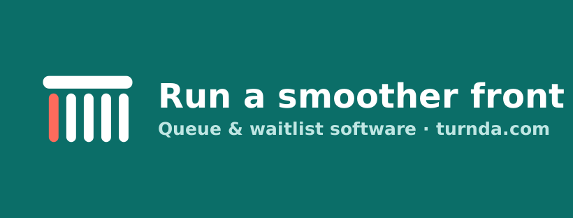
Headers and covers
- LinkedIn company banner 1128 × 191 — PNG · SVG
- X header 1500 × 500 — PNG · SVG
- Facebook cover 820 × 312 — PNG · SVG
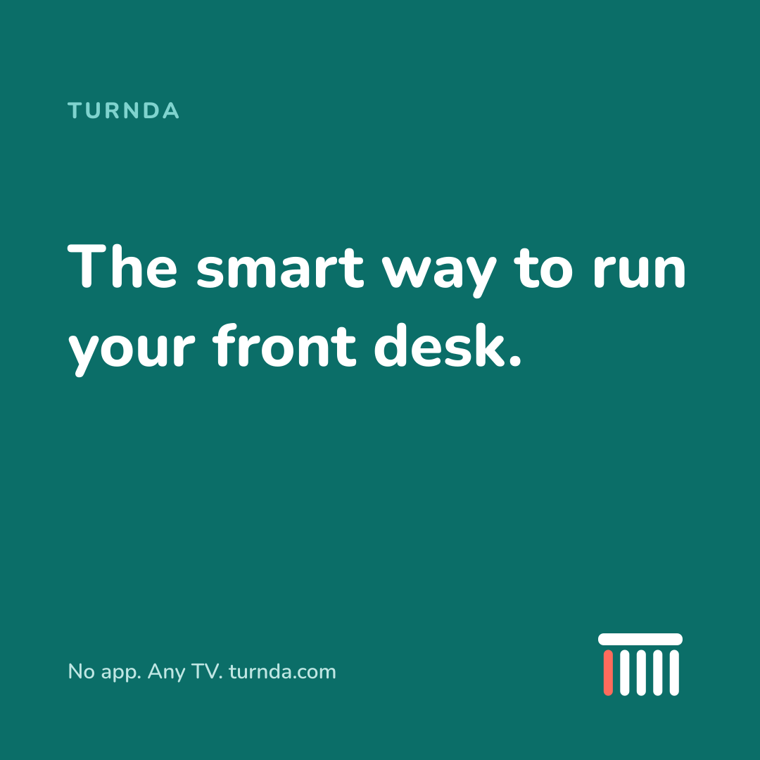
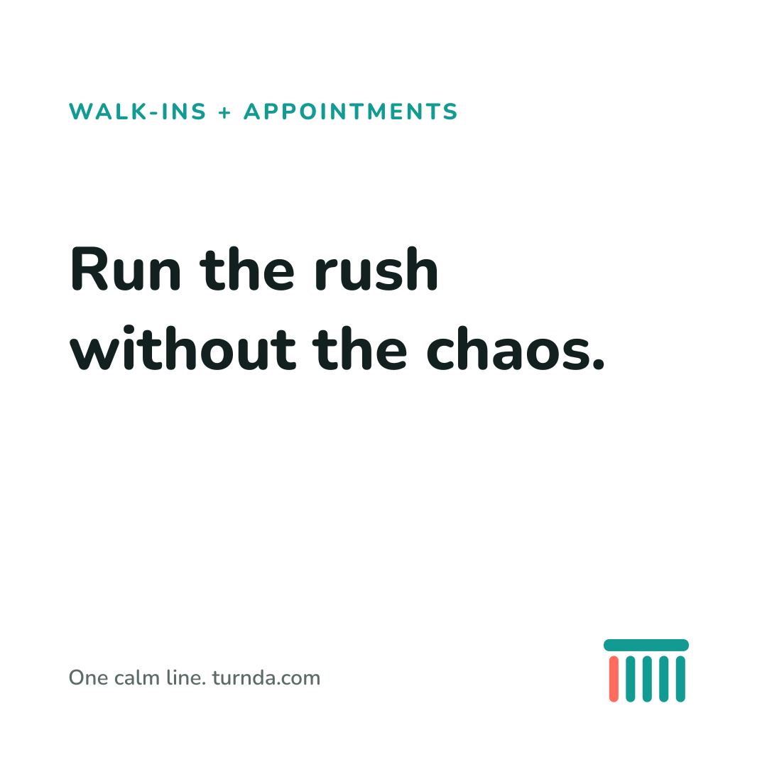
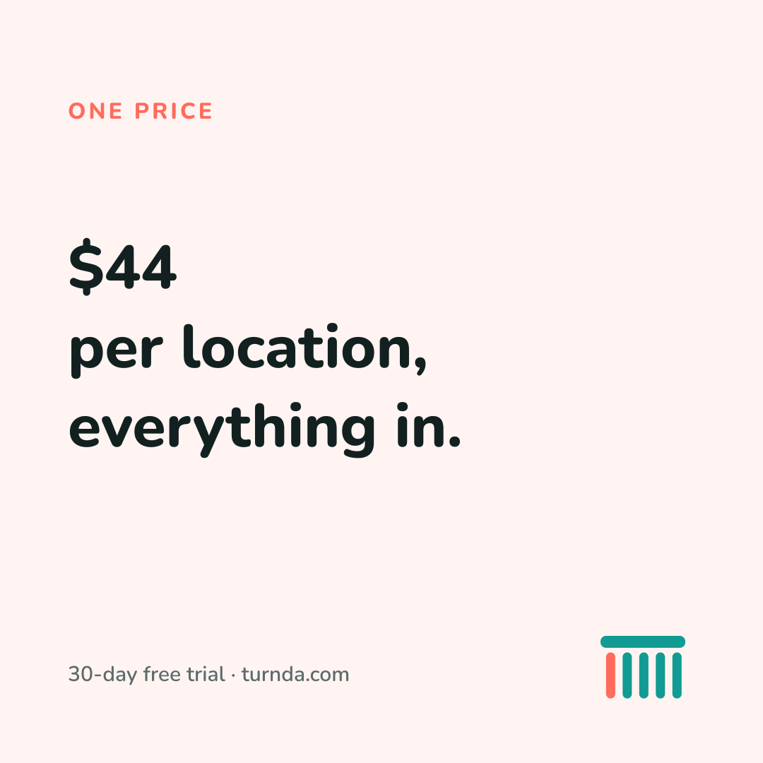
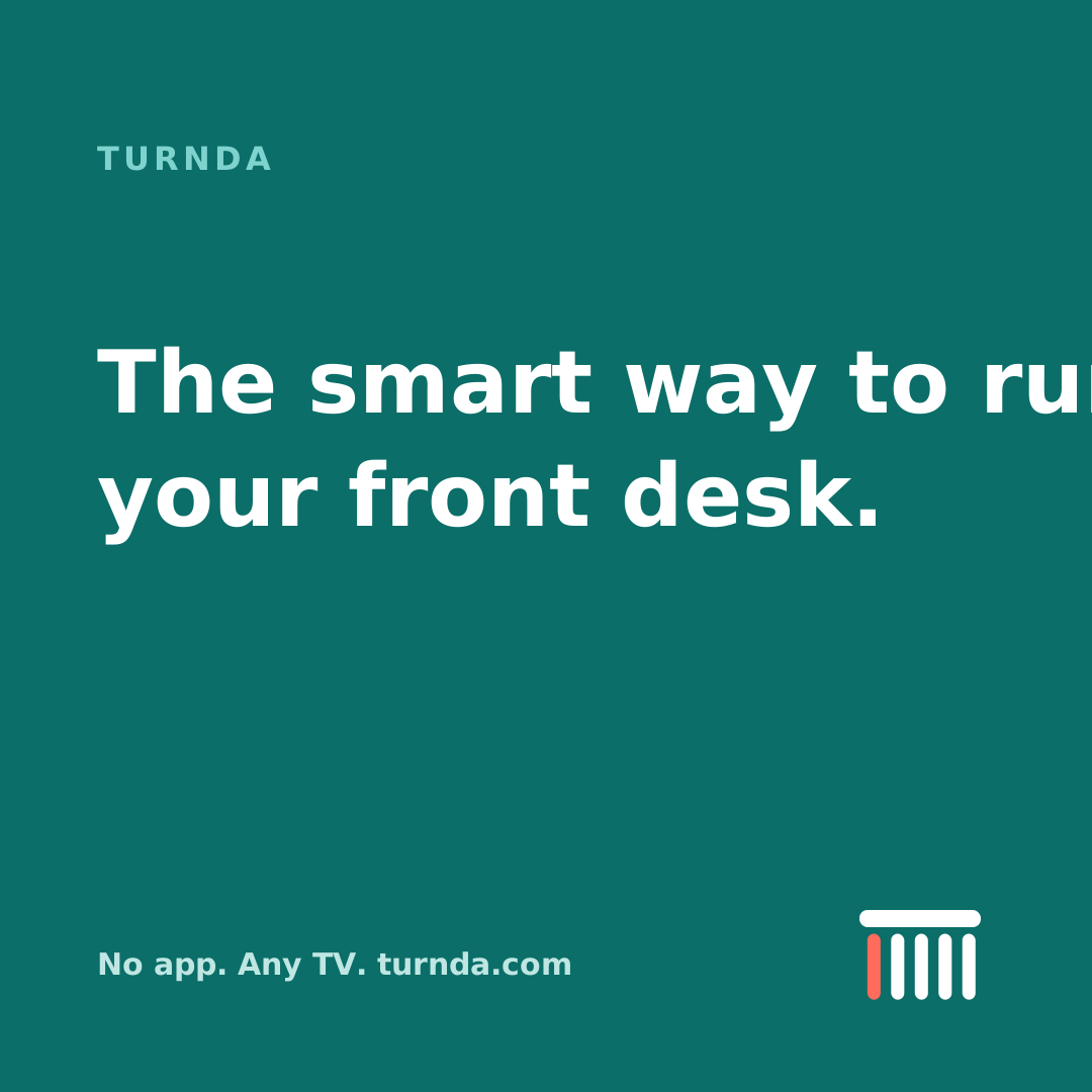
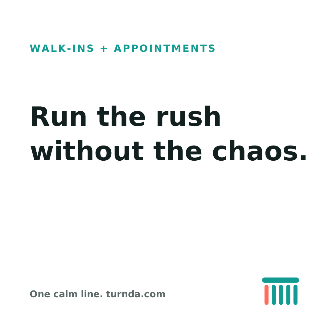
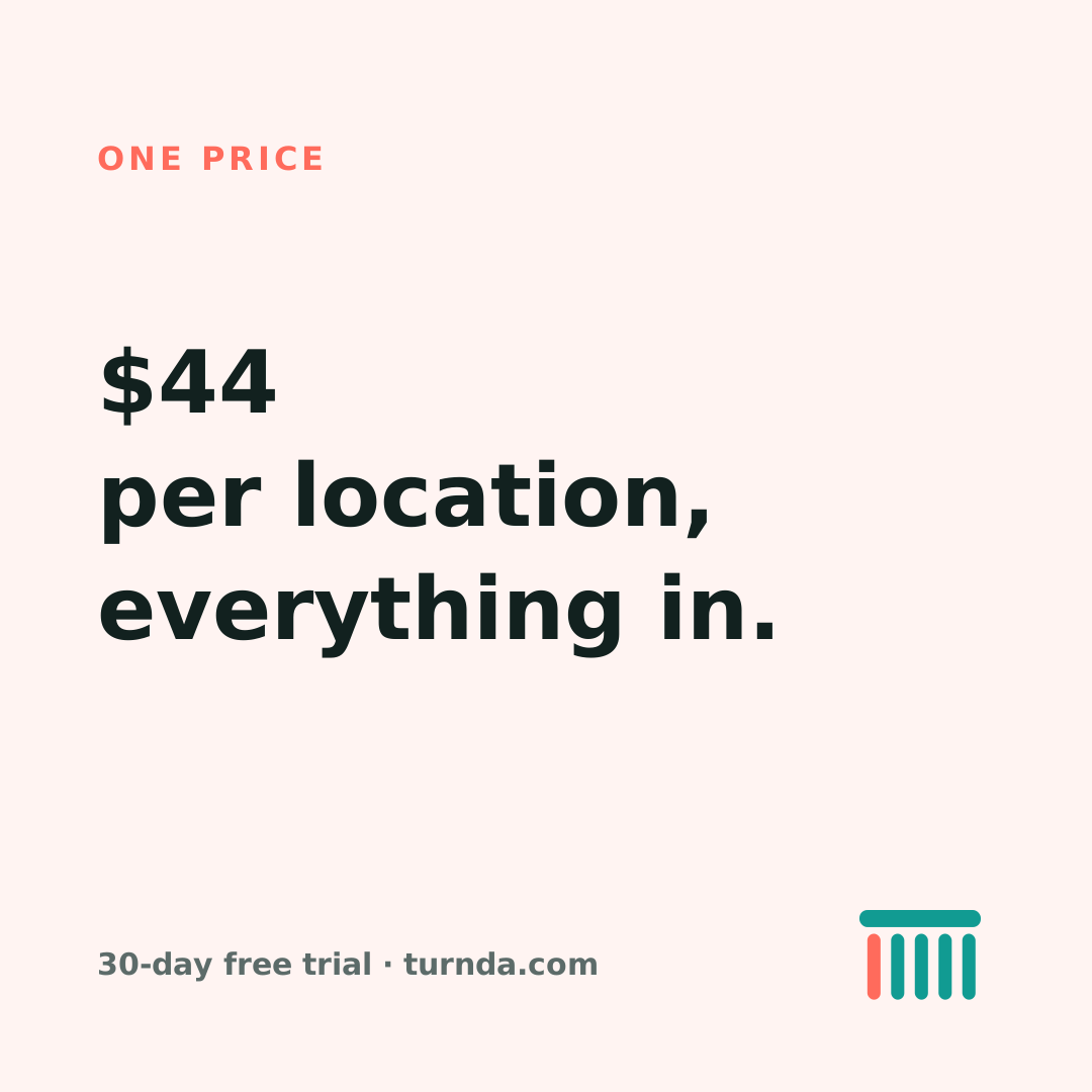
Post templates — 1080 × 1080
Open the SVG in any editor and change the words. The layout, colours and clear space are already right, so a post takes a minute rather than an afternoon.


Logos as PNG
The SVGs above are the originals and should be used wherever they are accepted. These are for the places that reject them.
Product screenshots and motion
This kit covers the logo, colour, type and social assets. Real product screenshots and short screen recordings need captures from the live app and are not here yet — the placeholders across this site are deliberately drawn as wireframes so nothing is ever mistaken for a real screenshot. If you need product imagery now, ask us and we will send what exists.